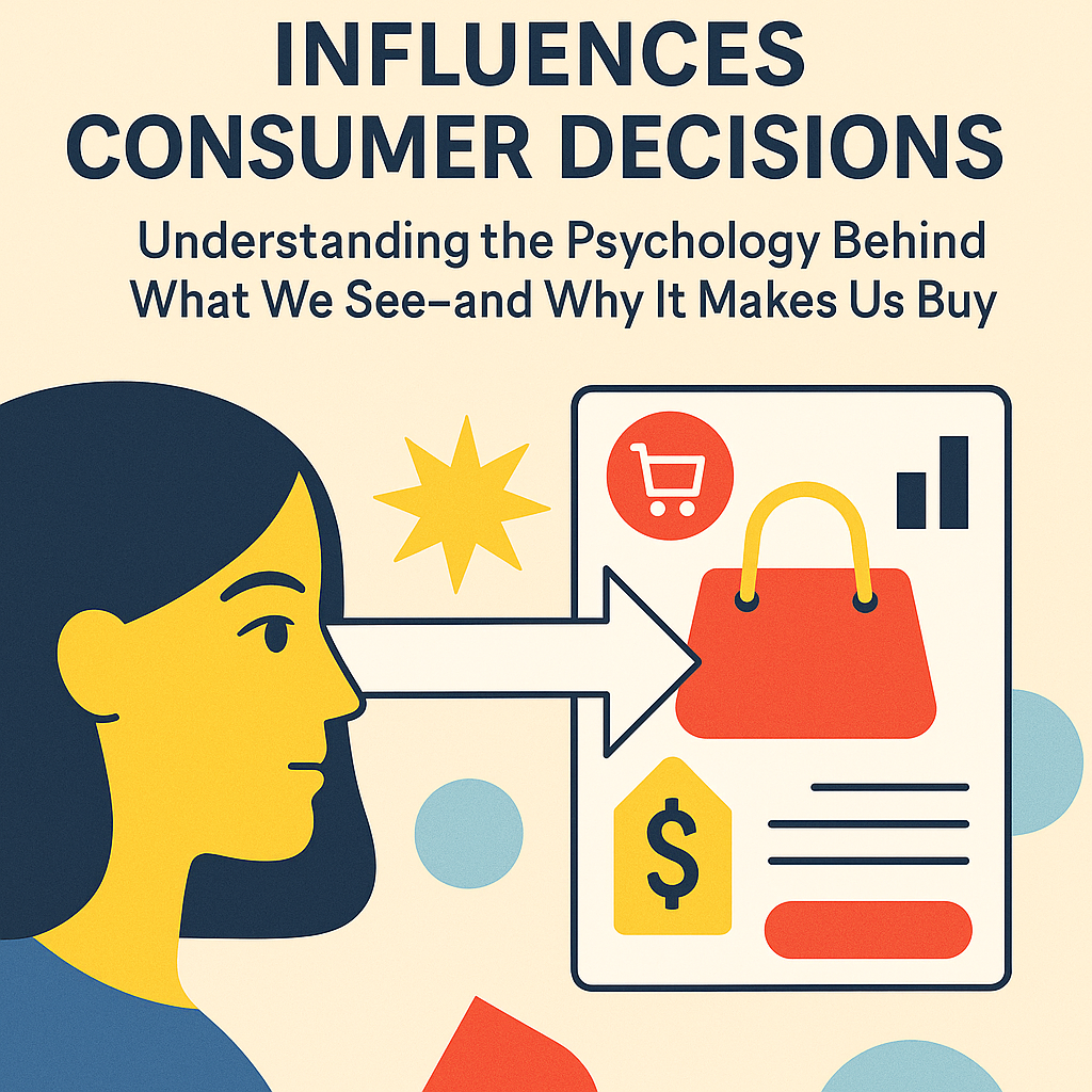
How Visual Communication Influences Consumer Decisions Understanding the Psychology Behind What We See—and Why It Makes Us Buy
In an age where consumers scroll, swipe, and skip at lightning speed, visual communication has become more powerful than ever. A product’s success doesn’t just depend on what it is—but how it’s seen. From social media ads and website banners to packaging and in-store displays, the way a message looks plays a critical role in shaping consumer behavior.
So how exactly does visual communication influence decision-making? And more importantly, how can brands use this knowledge to gain a competitive edge?
Let’s explore how visuals drive consumer choices—and how you can apply these insights in real-world marketing.
The Science: Why Our Brains Prefer Visuals
Our brains process visuals 60,000 times faster than text. That’s not just a fun fact—it’s a marketing weapon. According to MIT researchers, the human brain can identify images seen for as little as 13 milliseconds. This means your visual message needs to hit hard and fast.
In fact, studies show that people retain 80% of what they see, but only 20% of what they read and 10% of what they hear. If your product or brand relies solely on text-based messages, you’re probably leaving impact (and conversions) on the table.
Here’s where a smart visual strategy comes in. Whether you’re designing product packaging, social content, or event signage, effective visuals lead to faster recognition, stronger memory, and higher trust.
Want a tip? If you’re creating print materials that need to make an immediate impression—like event flyers or retail signage—you can save time with a printable poster tool that simplifies design while ensuring professional results.
Real-Life Use Case: Apple’s Minimalism = Maximum Trust
Think about Apple. Their packaging, ads, and product displays are visually minimalist—but insanely effective. Why? Because clean, consistent, and bold visuals communicate simplicity and elegance. They look easy to use before you even touch the product.
This isn’t an accident. Apple’s visual communication builds trust and aligns perfectly with their brand identity. Consumers feel like they already know the product, even before using it.
That’s the power of visuals—they create a story before words even begin.
Colors That Speak—and Sell
Colors aren’t just for aesthetics. They trigger emotions, perceptions, and even purchasing decisions.
- Red creates urgency and excitement—think clearance sales.
- Blue conveys trust and stability (popular with finance and tech brands).
- Green suggests health and sustainability.
- Yellow grabs attention (but overuse can cause fatigue).
- Black implies luxury and sophistication.
When choosing colors for marketing materials, ask yourself: What emotion do I want people to feel before they even read a word? That’s your color cue.
Fonts and Layout: More Than Style
Typography and layout are often overlooked—but they matter. Serif fonts (like Times New Roman) feel traditional and trustworthy, while sans-serif fonts (like Helvetica) feel modern and clean. Fancy script fonts might look elegant, but they’re harder to read—especially on mobile.
Your layout matters too. If your design is too cluttered, users won’t know where to look. If it’s too plain, they might scroll right past it. A strong visual hierarchy—where headers, subheaders, and calls to action clearly stand out—guides users toward what you want them to do.
For example, bold CTA buttons, larger font sizes for key points, and generous white space all improve conversion rates.
Visual Consistency = Brand Trust
Consumers are 3.5 times more likely to remember a brand if it’s visually consistent across all channels.
So if your Instagram uses soft pastel tones, but your website features bright neon accents, that mismatch can erode trust. Consistency in color palette, font usage, logo placement, and tone builds recognition—and recognition breeds trust.
Actionable tip: Create a visual style guide and stick to it religiously across platforms. This ensures your audience always knows what to expect—and subconsciously feels more connected to your brand.
Storytelling Through Imagery
People don’t just buy products—they buy stories. A compelling image can communicate an entire narrative in one glance.
Consider Nike. Their imagery doesn’t just show shoes. It shows sweat, triumph, motion, and perseverance. You feel inspired before you even see the price tag. That’s emotional marketing done right.
Want to tell your own brand story visually? Use photos that reflect your audience’s lifestyle, aspirations, or challenges. Better yet, include real customers. Authenticity beats stock photos every time.
Final Takeaway: Design Is Not Decoration—It’s Strategy
Visual communication isn’t just about “making it look nice.” It’s about making consumers feel something. It’s about driving action, building trust, and shaping decisions.
To recap:
- Use clear, consistent design across platforms.
- Match colors with the emotions you want to evoke.
- Choose typography that reinforces your tone.
- Tell visual stories that connect on a human level.
- Make tools like a printable poster part of your workflow to streamline results.
- Whether you’re building a brand from scratch or optimizing an existing one, remember this: people see before they think—and that first impression is everything.
So make it count.